Starting Search off on the right foot
Digitec/Galaxus Search Dropdown
Digitec & Galaxus are combined the biggest Online Shop of Switzerland with over 2.3 Million customers.
This assignment had the goal of simplifying the Search Dropdown, making it easier for users to formulate a search query. We were hoping to see improvements to KPI's such as Sessions with Search, Click Through-Rate and Conversion Rate.
Category
Interaction Design, User Experience Design, User Interface Design
Company
Digitec Galaxus AG
Year
2019
Problem Statement
The Search Dropdown at Digitec & Galaxus (DG) was tailored to Power Users who knew what they were looking for. When the user started typing we would perform a live search after each character input - across multiple different parts of the Shop. We would search and display results for pages and categories within the shop taxonomy, products, magazine articles & authors.
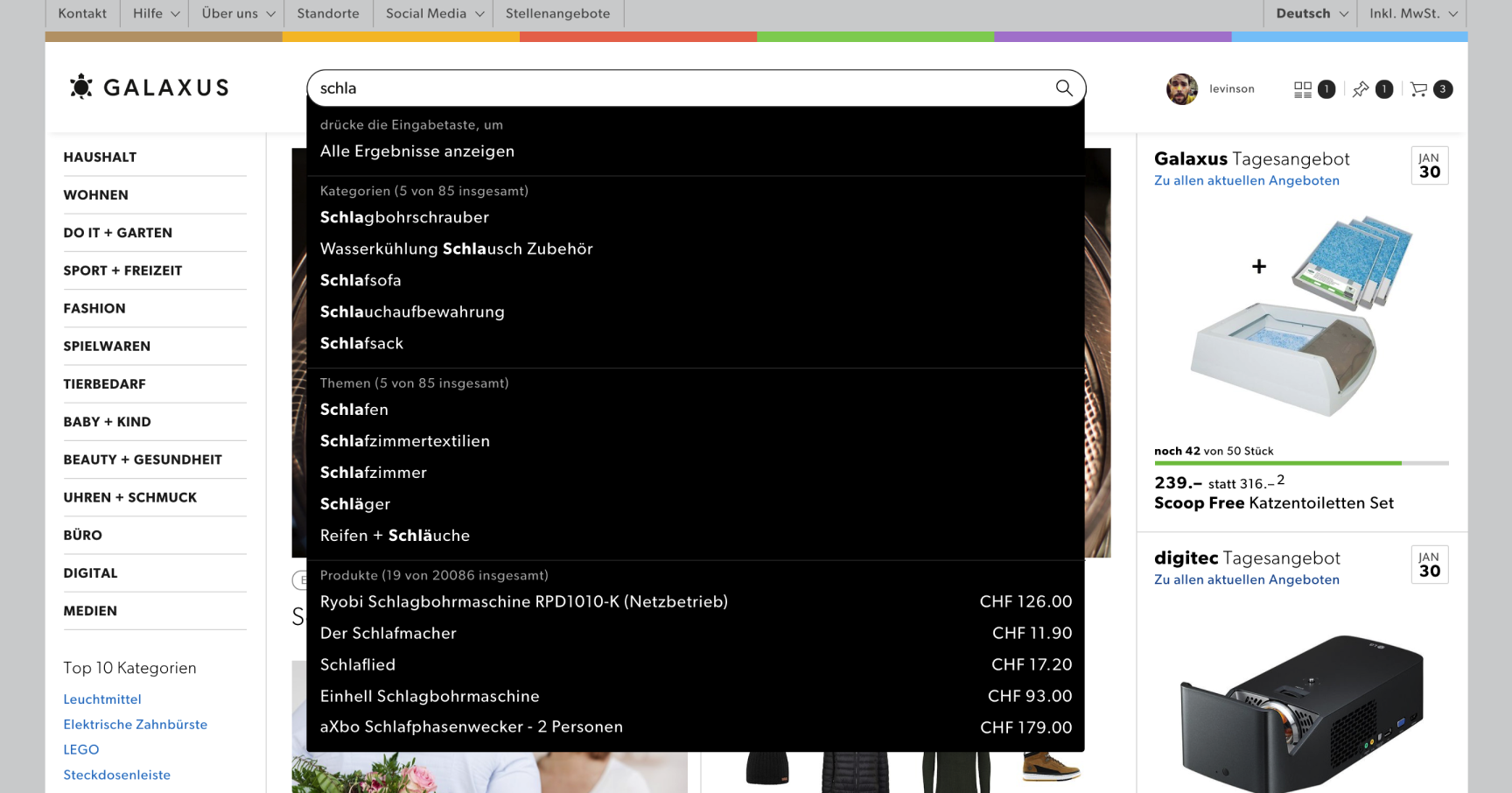

During various User Testings we had observed that a few users who knew what they were looking for and had a good domain knowledge quickly found what they were looking for, but most users struggled with this complex, information-heavy Interface. That in combination with the eCommerce research library from Baymard Institute convinced us we needed to simplify this interaction and tailor it more towards non-expert users.
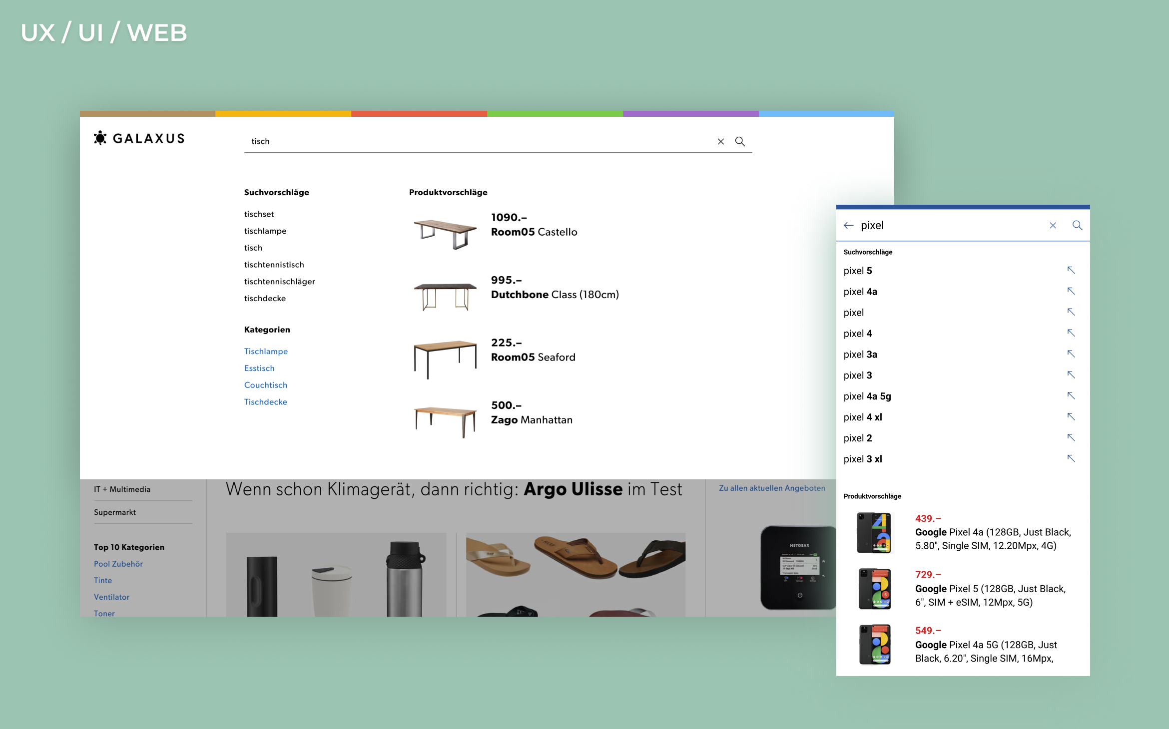
Search Suggestions
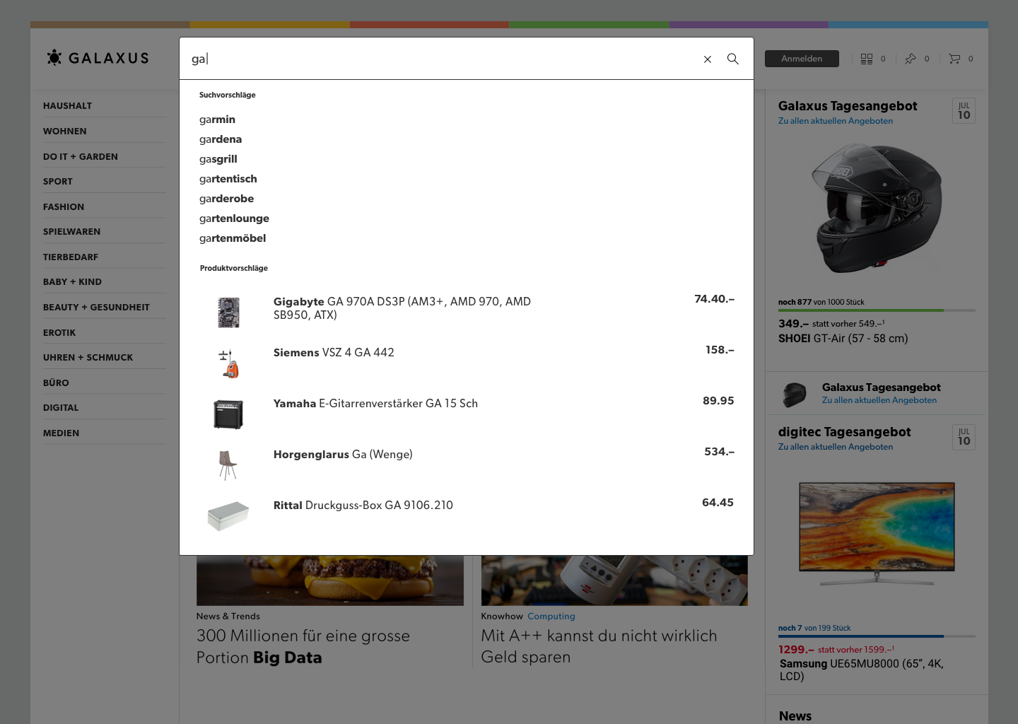
We came up with the idea that the mission of the Search Dropdown was to help the User formulate as good of a search query as possible. Displaying the results of that query and helping the user find the relevant content for it were problems for later in the User Journey. The Team and our Stakeholders agreed that we needed to simplify the Search Dropdown, but to help the user write a good query we needed to add a new component - Search Suggestions.
This actually worked out quite well, since we could remove a lot of the entities that we were currently searching through as the user typed, and replace them with suggestions. This would reduce the amount of information the user had to digest while at the same time helping them construct a query.

Early Ideas
The Product Suggestions in the Dropdown were already performing pretty well. All our metrics said we should keep them, and we'd also observed how they helped power users get to their goal quicker during testing. They could however be improved upon. We'd seen that the products were hard to parse and compare when they were displayed as text only, so we decided to add pictures and style them more like the other product displays we had throughout the Shop.
During early testing, we discovered that this had the added benefit that users could glance at the products to see if their query returned approximately the results they were looking for.
Turning an Idea into Reality
So we had a concept that felt right and had shown positive signs in early testing. Now we had to develop it into a functioning product. That meant coming up with answers for how the dropdown should look and behave in all possible different states, what interactions should be available, and finalizing the visual design.
We wanted the Interface to be simple to use yet have all the state-of-the-art features. We put a lot of emphasis on keeping the design clean and simple for the basic use cases, but jam-packed with features for power users. One focus area was keyboard navigation. On devices with a keyboard, a lot of users rely solely on the keyboard for both input and navigation while searching. Full keyboard support meant not only enabling navigation by keyboard input, but also that when a user navigated to a suggestion, we would automatically fill it in the input field to allow them to keep typing a query based on the suggestion. We also live-update the product results when navigating the suggestions.
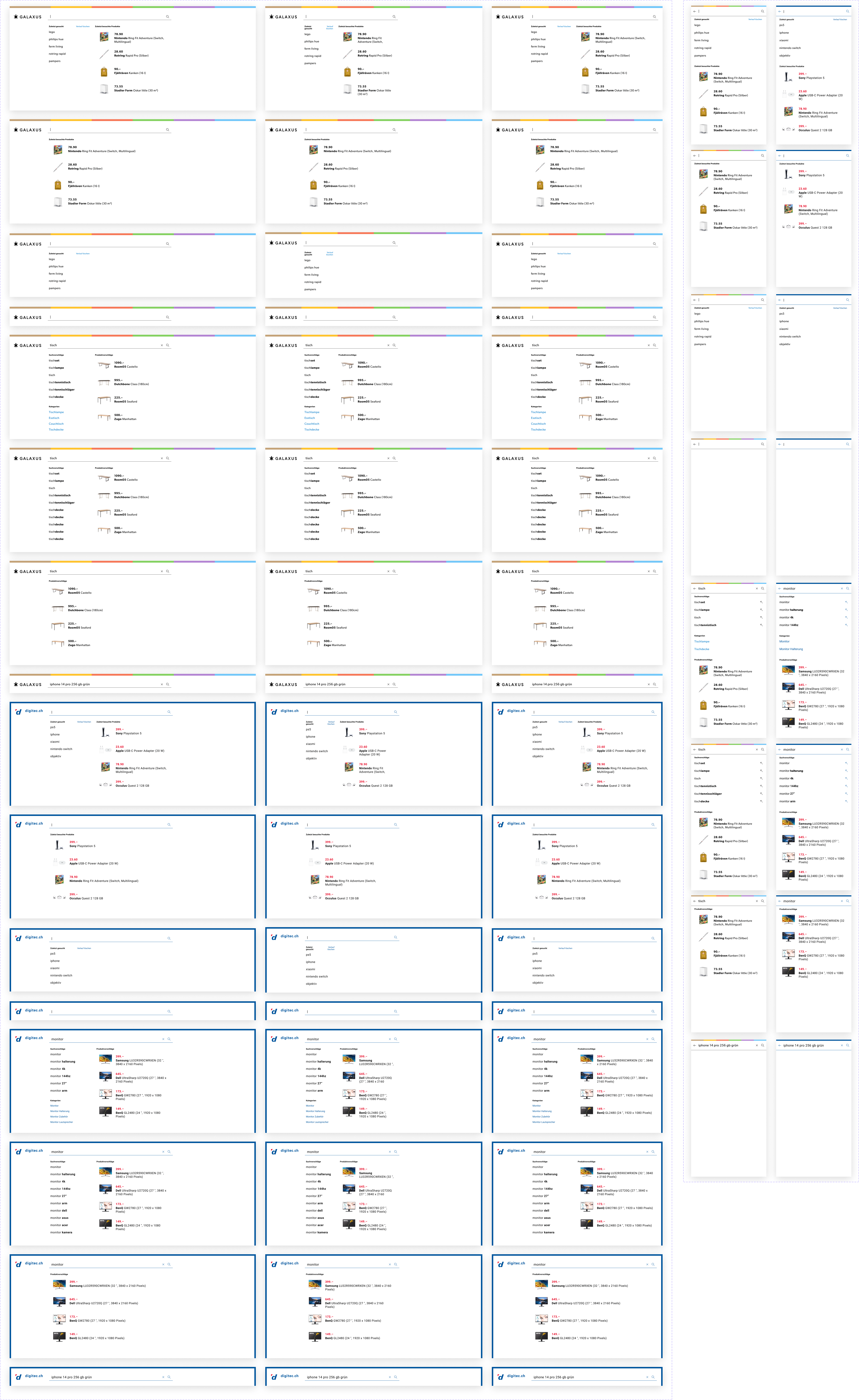
We also had to cover every state, from what happens when a user clicks on the search field to begin searching, to when they've entered a query that yields no suggestions or product results. I started with designing the most common case (suggestions + products), and then tried to come up with layouts that gracefully degrade when content is missing.
The True Test
The Team had done an amazing job in translating our ideas into code, and we were finally ready to start testing the real product. User testing revealed a few minor issues that were quickly addressed, after which we decided to start bringing the new search experience live into production.
At Digitec Galaxus we have a strong testing culture, and this would be no exception. We started by launching the new experience (which we had now named Instant Search) internally to all employees. The feedback was overwhelmingly positive, although we did face some scepticism for removing the links to all the different entities we had previously displayed. We still felt great about the Instant Search though, and decided to move forward with A/B-testing.
Excited, we released the new Instant Search to 50% of our visitors, and watched as the numbers started pouring in. The metrics kept swaying back and forth and after 2 nervous weeks of testing we did our final analysis.
Unfortunately, the new search performed slightly worse than the old one. The difference was small, but we had hoped for an increase in our KPI's. Digging deeper into the metrics, segmenting for device type & Shop (digitec or Galaxus), we didn't get any more answers. Metrics were up for one KPI in one of the Shops, but down for another in both Shops. Click-Through rate was higher on Desktop, but lower on Mobile - but at the same time Conversion Rate was up on Mobile. This is where I learned a valuable lesson.
We couldn't figure out what was causing the problems, because we were testing too much at the same time. We had completely changed the Design of the Search Dropdown, improved the Products displayed and introduced our new suggestions. It was impossible to tell which change caused what change in behaviour and to what extent.
We were convinced we were on the right track though. Since the numbers were so close we thought we could tweak our Search a little to get it over the line. We'd received feedback from internal Stakeholders that they were missing the links to Product Categories most of all. This was also the entity with the highest usage and conversion rate of the ones we had removed. Incorporating them in the Instant Search, we launched a new A/B-Test.
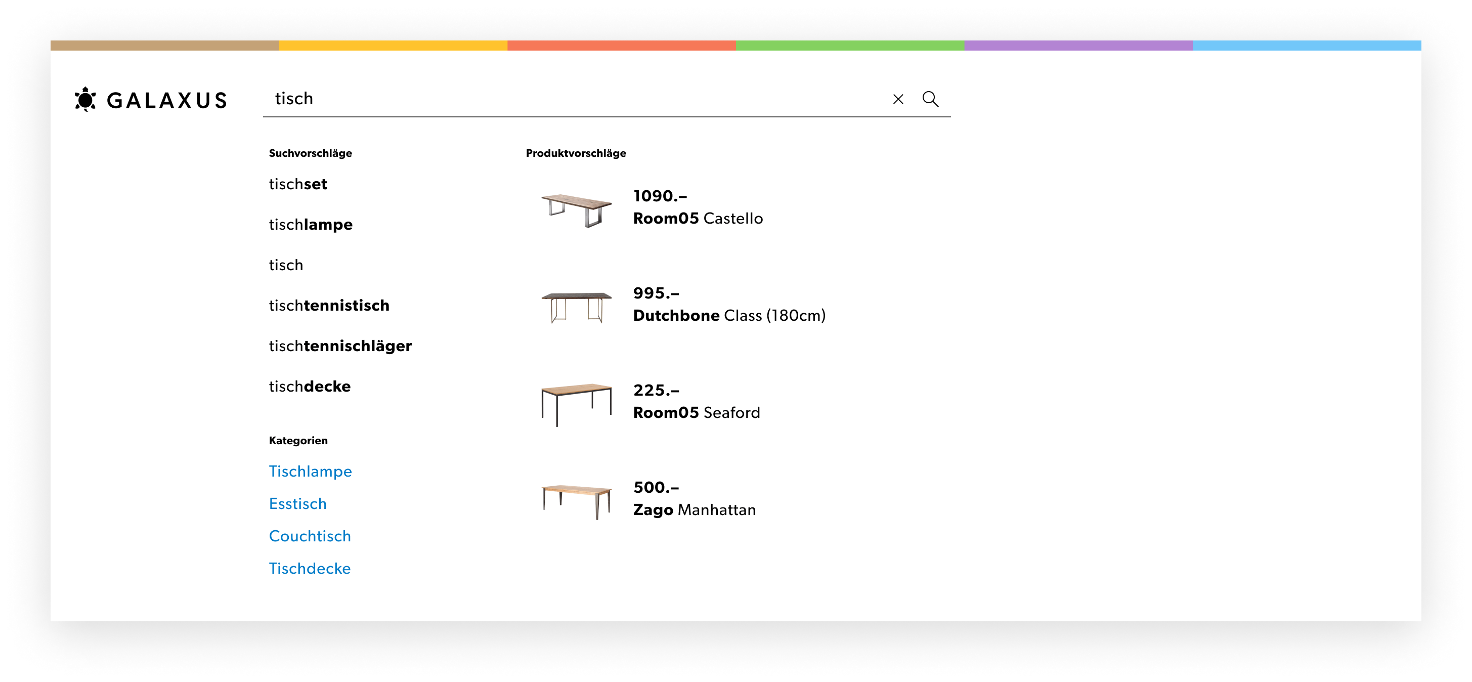

This time the test was successful! Almost all our metrics were up. Not by much, but enough to warrant a release to all users 🎉
Since then, we've made several improvements to our suggestions, and to the Search Engine Result Page. (Remember the part in the beginning about how displaying the results of the query and helping the user find the relevant content for it, were problems for later in the User Journey) As a result people searching on digitec and Galaxus are more successful than ever in finding what they are looking for.
Showcase
Have a design challenge you need help with?
