Brand Refresh
A brand refresh for a pivoted service
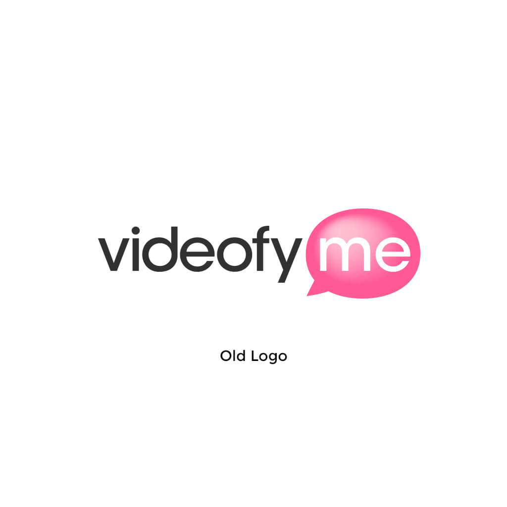
Videofy is a social network for video creators. When it was founded it was called VideofyMe and was primarily centered around creating vlogs using a computers built-in camera. After pivoting to a mobile service the old brand and name didn't match the vision of the company.
I was tasked to refresh the brand to a clean, modern look and feel that didn't focus on the user talking into the camera.
Category
Branding
Company
Videofy
Year
2014
Background
When Videofy launched it was called VideofyMe. It was fitting, because the idea was that bloggers would create vlogs talking into their webcam. The focus was on the person in front of the camera. 2 years later the service pivoted to a social mobile video app, where the person behind the camera was in focus. Shooting little snapshots of their day, a trip, a concert or something and combining them in to a little video story. They stuck with the old brand for about a year after releasing the new service, but we always felt it should be refreshed to reflect the new service better.

Ideas
We sat down with the whole team to figure out a few key words as to who we are and what we do. We came up with a few words that everyone agreed on and I was tasked to think up some early options of a logo.
We wanted our symbol to reflect the creation part of the app, so I started with a few basic video production related symbols.


Further exploration
We quickly decided we didn't want to use a film reel or some other symbol from the 'old world of video', but rather something from the modern digital world of video. We decided to go forward with some different versions of the play icon and a lens icon. I quickly drew up a lot of different concepts to share with the team.


Settling for one option
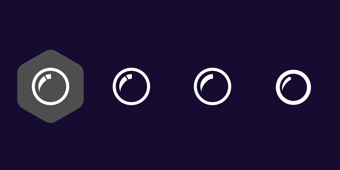
After some discussion we came to the conclusion that the different play icons focused too much on watching videos, when in fact we were primarily trying to attract video producers. Hence we decided to go with some sort of lens icon. The version above felt way to cluttered with the different colors and the broken reflection in the lens. Time to simplify!

Showcase

Have a design challenge you need help with?
